

In Praise of Atlanta
In Praise of Atlanta
Atlanta's midfield terminal defined what a hub airport should look like

“Atlanta is the world’s most profitable and powerful airline hub,” my friend and former colleague
frequently tells me.And Shabat would know. He co-authored the book on Delta Air Lines’ post-9/11 rise, Glory Lost and Found, as well as co-founder and an analyst at Skift’s Airline Weekly. And anyone familiar with Delta’s business knows its hub at Hartsfield-Jackson Atlanta International Airport is critical to its success.
Atlanta is the busiest airport in the world by a wide margin; it saw nearly 105 million annual passengers in 2023 compared to runner up Dubai International Airport’s nearly 87 million, according to the Airport Council International’s annual ranking. And it does that on about two-thirds of the land of Dubai’s airport, and even less when compared to modern mega airports like Denver, Doha, or Shanghai Pudong.
And it handles all those passengers at very low costs. The average cost per enplaned — or boarded — passenger in fiscal 2023 (the year ending that July) was just $2.23, according to the airport. For comparison, the metric was $11.56 and about $11 at major U.S. hubs Dallas-Fort Worth and Denver, respectively.
What is Atlanta’s secret sauce? The design of its 1980 midfield terminal by Stevens & Wilkinson, and Smith, Hinchman & Grylls (now SmithGroup).
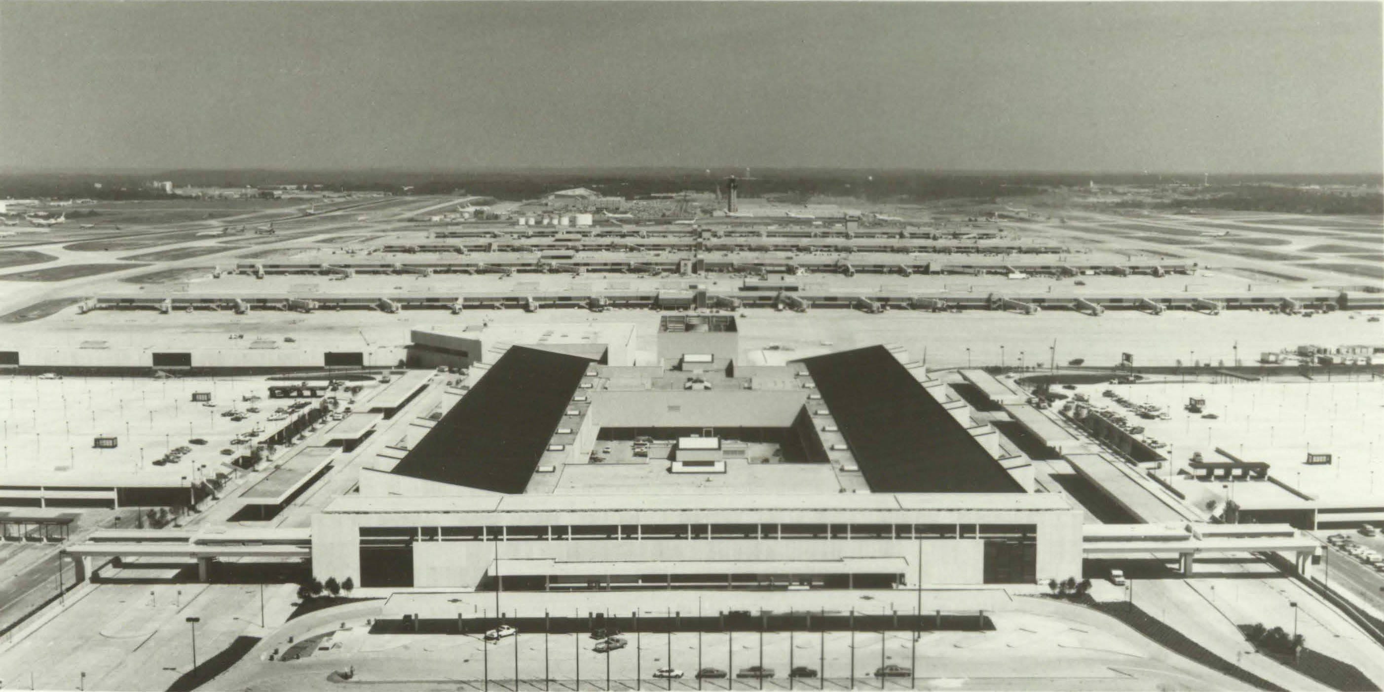
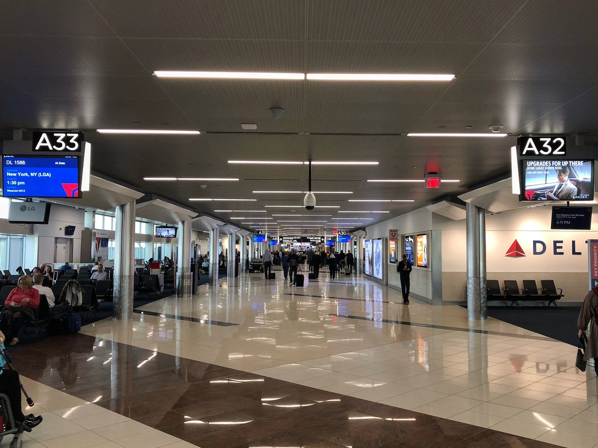
If you are one of the 105 million people that pass through the crowded, low-ceilinged corridors of the Atlanta airport today, you could be forgiven for not realizing that it was a seminal design. The brutalist terminal, the underground Plane Train and its parallel concrete corridor — the exception being the phenomenal forest-like “Flight Paths” between concourses A and B — and the uninspired linear concourses create a utilitarian aesthetic.
“Hartsfield raised the brutalist aesthetic to a new level,” wrote Alastair Gordon in Naked Airport. “The Midfield Complex was a 2.2-million-square-foot warren. Its megalithic concrete slabs were relived only by the occasional monitor skylight or venting duct. Dallas-Fort Worth seemed intimate in comparison.”
But Hartsfield-Jackson’s midfield terminal is important. It was the first major airport designed as hub where a majority of travelers connected between flights rather than came from or went to Atlanta. Many of its peers, particularly HOK’s Dallas-Fort Worth (opened 1974), adopted the prevailing airport design paradigm of the time that prioritized short distances from the curb to the gate.
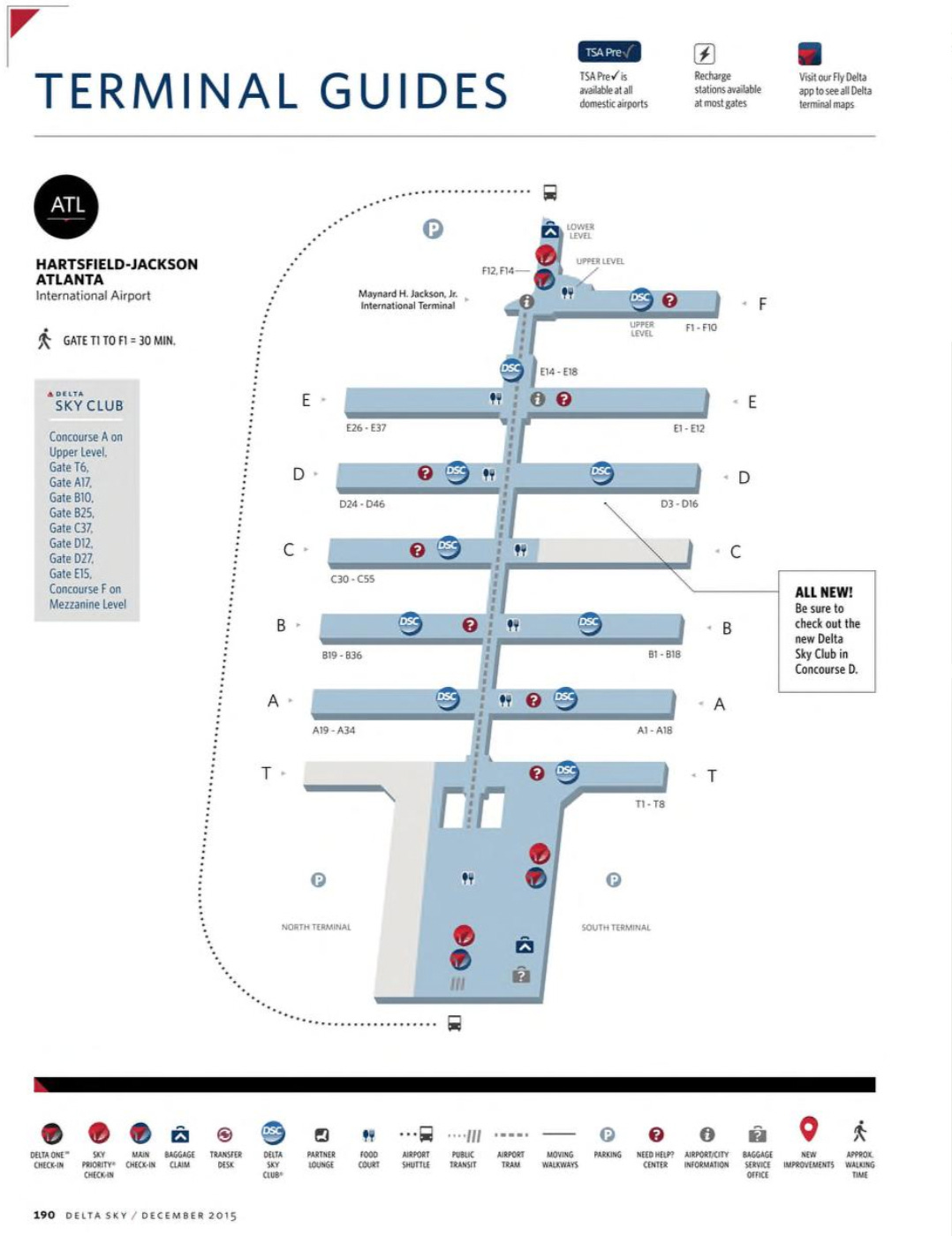
Atlanta’s concourses separated by 1,000ft taxiways and connected by an underground train (and walkway) to a single terminal building — the second international terminal designed by Gresham Smith opened in 2012 — has became the basic blueprint of large airport design in the four decades since it opened.
Chicago O’Hare Terminal 1 by Helmut Jahn (opened 1987) and the underway O’Hare 21 plan; Denver by Fentress Architects (opened 1995); Detroit McNamara Terminal by SmithGroup (opened 2002); Munich’s Terminal 2 by Koch + Partner (opened 2003); and London Heathrow Terminal 5 by Richard Rogers Partnership (opened 2008) and Terminal 2 by Luis Vidal + Architects (opened 2014) are just a slice of the airports that have followed in Atlanta’s design footsteps.
How the team led by Stevens & Wilkinson got to the midfield layout was far from linear. It took twists and turns, and drew from the major U.S. airport projects of the 1970s.
Work on Atlanta’s midfield terminal began almost as soon as the airport’s barrel-vaulted — and forever gone — 1961 terminal opened. Betsy Braden and Paul Hagan, who chronicled the process in their 1989 book, A Dream Takes Flight: Hartsfield Atlanta International Airport and Aviation in Atlanta, wrote that the first expansion studies began in 1964, just three years after the opening confetti was cleaned up at the Robert and Company-designed “jet age” terminal.
“No precedent existed from which Atlanta’s airport planners could draw,” Braden and Hagan wrote on the dilemma of how to design an airport that catered to connecting travelers.

While there was no a precedent for a connecting airport, many of the components already existed. Take, for example, separating “airside”1 and “landside”2 facilities into separate areas. Reynolds, Smith & Hills’ (now RS&H) design for Tampa International Airport (opened 1971) pioneered this separation at U.S. airports.
“From postwar years through the 1960s airport designs were based on a single-terminal concept that lumps together all services-from ticketing to boarding-in one building. In its place, the designers of Tampa divided services into two separate areas-one called ‘landside’ and the other ‘airside’-linked by a rapid people-moving system,” wrote Peter Rohrbach in the October 1982 issue of AIA Journal.
But the design for Tampa, like its contemporaries, was focused on minimizing the walking distance for local travelers — not ones connecting between flights.
The Stevens & Wilkinson team picked up on Tampa’s airside/landside split and adapted it to the evolving plans for Atlanta’s midfield terminal, wrote Braden and Hagan:
“In a conceptual breakthrough in 1973, the complex had been split into two distinct sections: airside terminals with aircraft parking gates and landside terminals for ticketing and baggage claim. Although the separation was not considered particularly significant at the time, it marked the point at which the airport veered away from its ‘drive to the plane’ stance and began to deal with the particular requirements of a transfer airport.”
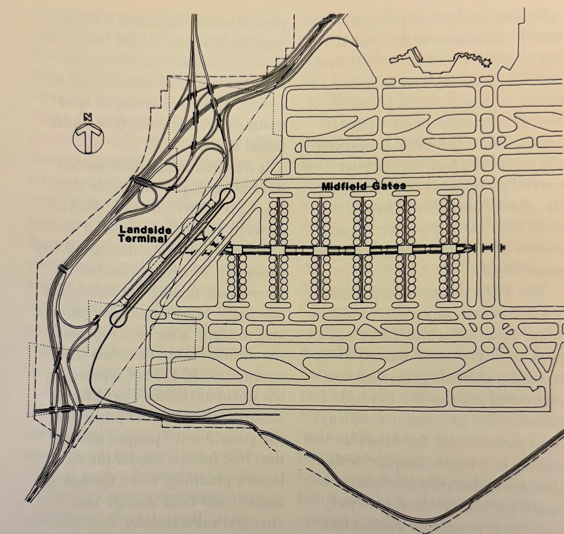
The final piece of the plan, wrote Braden and Hagan, was burying the central services spine — the Plane Train, walkway, and other services corridor — rather than leaving it exposed to the elements. The idea, they wrote, came at the suggestion of Delta. This occurred in 1975 after an ice storm shut down a similarly exposed-to-the-elements automated people mover system at Dallas-Fort Worth.
“Placing the people mover underground was a stroke of genius, for it also removed a barrier between the north and south runway systems and eliminated the need for costly taxiway bridges,” they wrote. It also allowed for more gates that airlines so desperately wanted.
Delta, in a 1980 promotional brochure for the new facility, touted the efficiency of design for both travelers and the airline. The airside-landside split allowed travelers to connect “without need to enter terminal buildings,” and the midfield position at Hartsfield-Jackson would “reduce runway crossings and taxi distances to minimize ground delays and conserve fuel.”
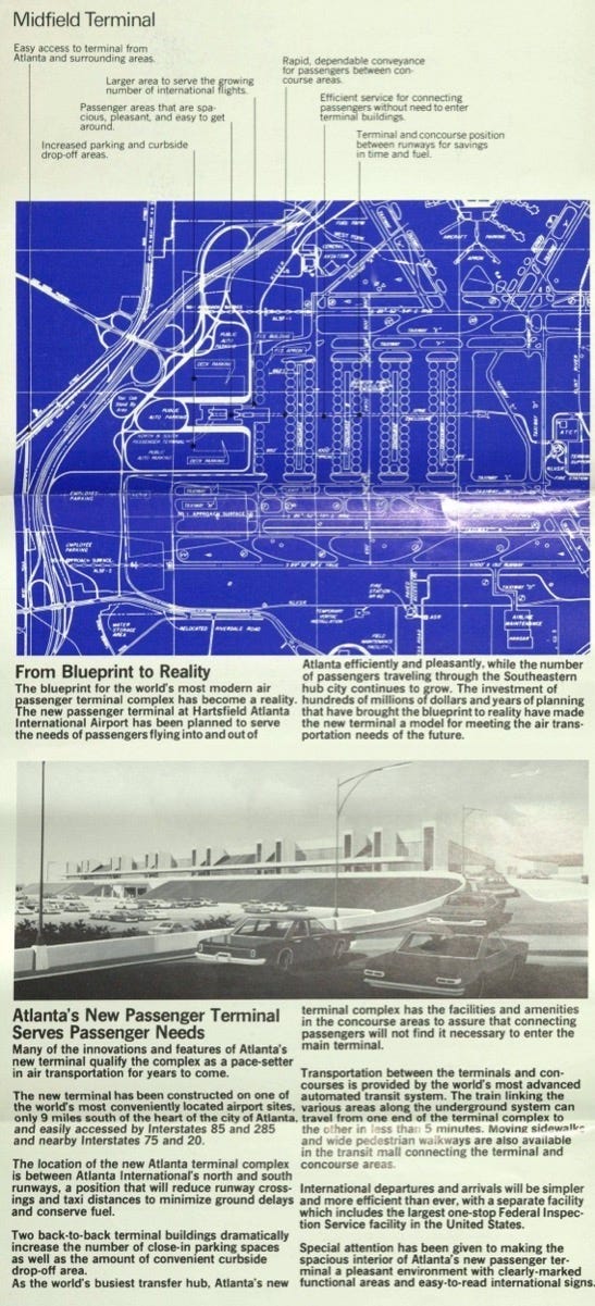
The result was a 138-gate facility designed for at least 55 million annual passengers that Delta touted as the “world’s most modern air passenger terminal complex.”
Braden and Hagan wrote that, “despite its size, the simple layout and straight lines made it one of the easiest to navigate.”

“The biggest miscalculation was the number of restroom facilities. There simply were not enough,” they add. The Atlanta airport did not then, and does not now, win prizes for its loos.
Contemporary travelers today might debate the claim that Atlanta’s midfield complex is “one of the easiest [airports] to navigate.” Growth during the past four decades, plus the addition of two more concourses — E in 1994 and F as part of the international terminal in 2012 — made an already large complex even larger. A common complaint are the often long walks between gates, even with the Plane Train. And crowding in the 1980 terminal building has resulted in a labyrinth of security queues, especially at peak times.
This is all the more ironic given Atlanta’s own marketing spin for the midfield facilities when they opened. In a 1980 release titled “Hassle-Free Connections,” the airport claimed: “Gone are the lengthy walks, the crowded concourses, the tedious taxiing times. The airport’s brand new passenger terminal complex … [is] the only one in the world designed and built with the needs and comforts of connecting passengers in mind.”

And the brutalist, seemingly uninspired terminal? That was the result of airlines’ push to cut costs wherever possible. Braden and Hagan wrote that carriers wanted an eight-foot ceiling in the ticketing area whereas the Stevens & Wilkinson team wanted more “volume” (a higher ceiling costs more).
The compromise was a concrete rather than limestone structure with repeated verticals and light wells that “enlivened the interior,” wrote Braden and Hagan. Or, the “occasional monitor skylight or venting duct,” as Gordon described them.
The aesthetic is, at best, utilitarian — and something all of the airports that followed in Atlanta’s design footsteps could improve on.


“Airside” refers to where all flight operations occur and, today, is considered the secure area of an airport.
“Landside” is the area outside security at an airport that is open to the public, even those who are not flying.
This is a really great piece! As someone who lived in Atlanta for 20 years I’d add a couple of other points. Your piece mentions several times that the Atlanta design is more optimized for the connecting passenger at the possible expense of the local one. This was especially true for international arrivals pre-2012, where you would need to clear customs, *re-check checked bags* and *re-clear security* just to leave the airport, the same experience connecting passengers faced. It was a huge pain coming off a long flight, and especially burdensome for anyone traveling with kids. Fortunately the new international terminal fixed that.
However - something the remote islands design achieves - which Tampa doesn’t- is operational efficiency - giving nearly every aircraft two or more paths to reach their gate. And this operational efficiency ends up helping whoever uses the airport more - typically locals.
Well done, Ned! What a great piece to wake up to!