

Miami boasts many architectural greats. South Beach’s Art Deco, Arquitectonica’s The Atlantis and other towers, and the Miami Biltmore in Coral Gables, among them.
Miami International Airport’s North Terminal, better known to American Airlines fliers as Concourse D, is not among them.
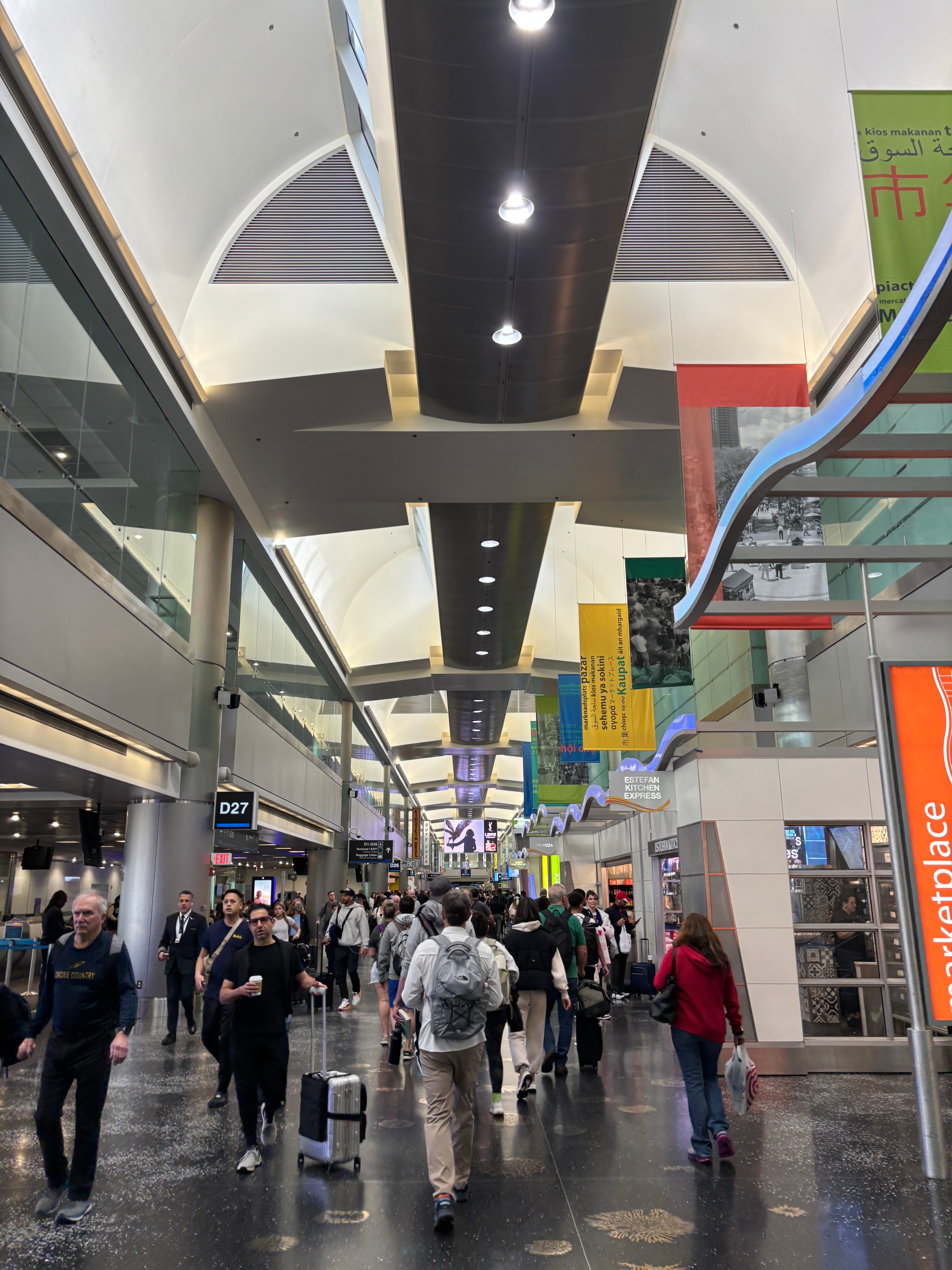
Walk through the concourse, as I have done on several occasions over the past few months, and you may notice how the 11-year-old terminal feels overbearing. It is as if the planners opted to showcase the (impressive) engineering of the structure rather than a design that celebrates the conveyance of air travelers to the sky and back again.
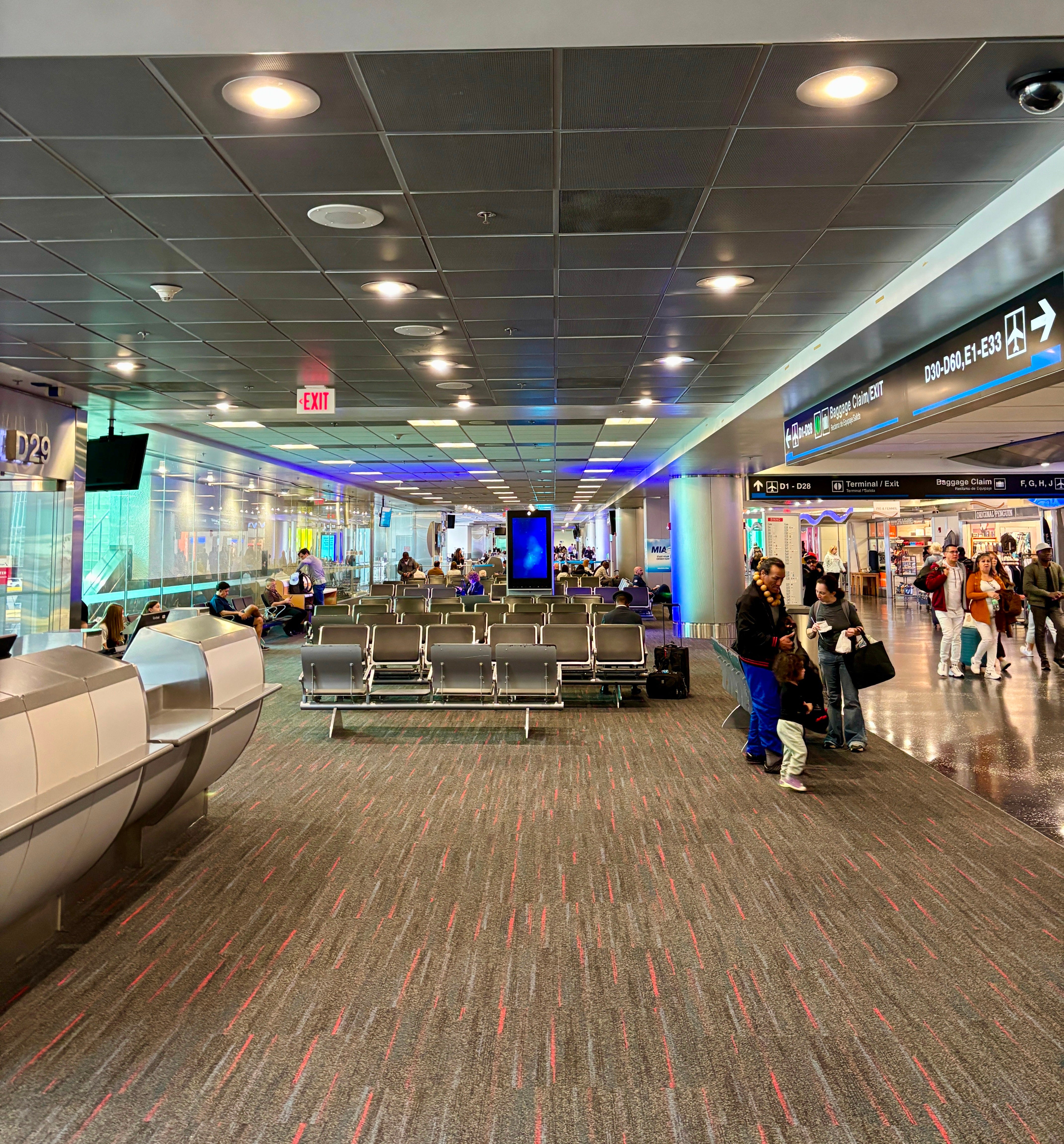
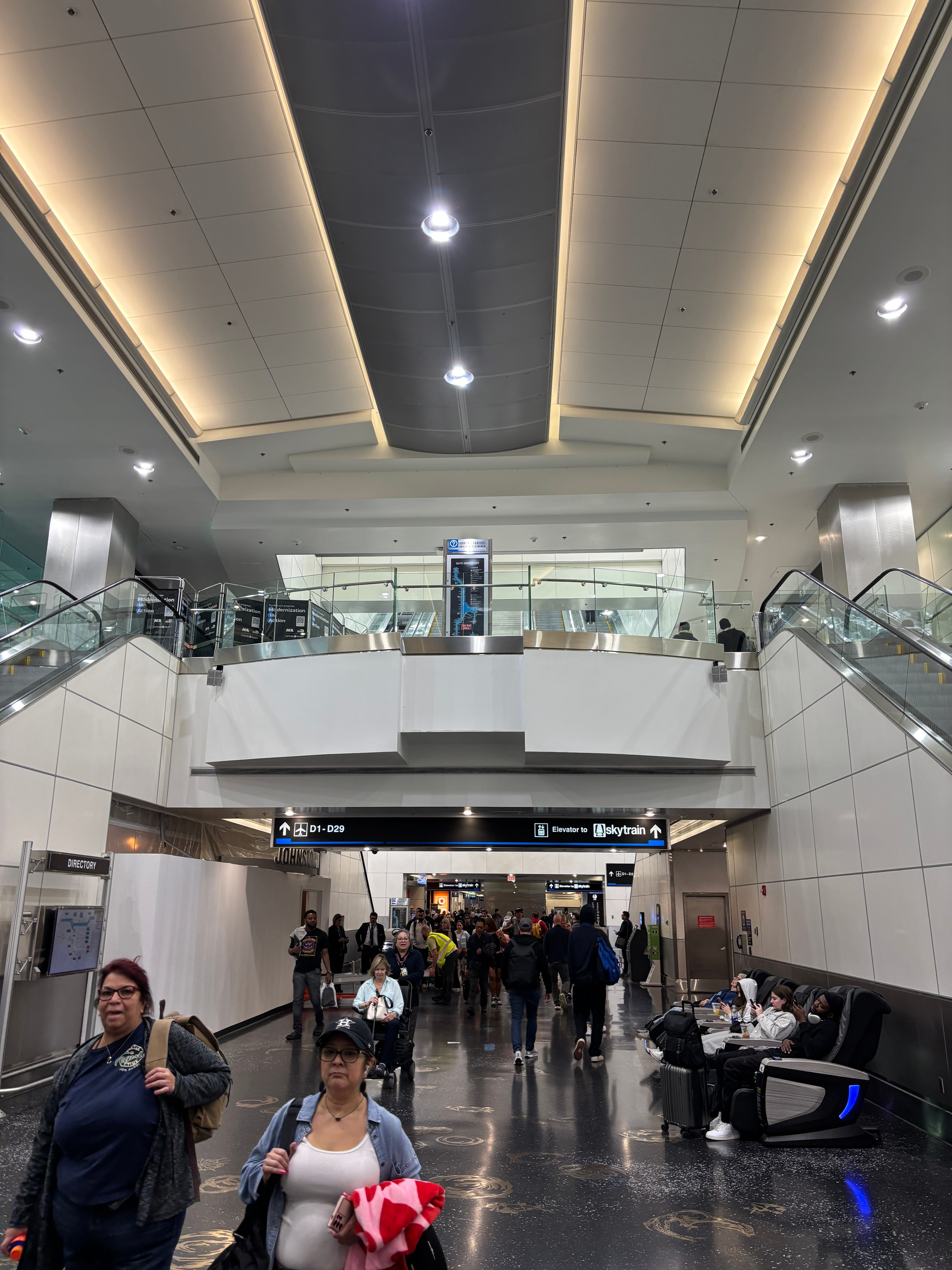
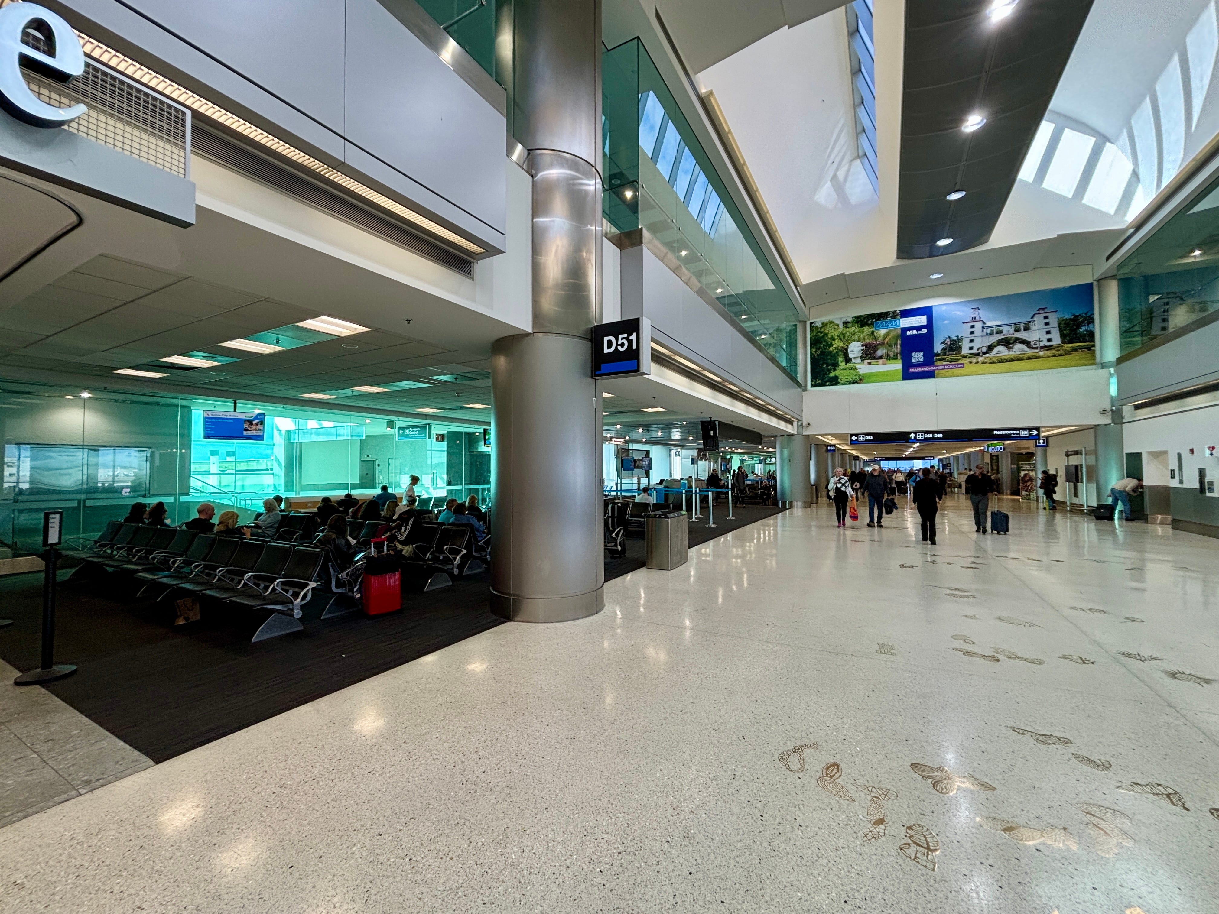
The central corridor of Concourse D feels like a trench that, while boasting high ceilings in many sections and the occasional skylight, feels isolated and distant from the activity outside. Many of the gate areas are unimaginative — row upon row of tandem bench seats — with drop ceilings. The structural supports, the engineering that holds the whole thing up, visibly break up the space interspersed with shops and the occasional Café Versailles. And there is no, to use that popular architectural catch phrase, “grand moment.”
Is it the worst terminal in the world? No. But given it is barely a decade old, one expects more.
How did Miami’s North Terminal end up so unimaginative? A deep dive into its development does not provide an exact answer but does paint a picture of a likely culprit.
From the start, the North Terminal project was a Frankenstein’s monster of new construction and renovating older buildings. The landside structure was renovated, while the airside was mostly built new. The architects — there were at one time 44 firms involved, including Corgan and Leo A Daly, according to the Miami Herald1 — had to marry the structures while creating a cohesive look and feel that was both cost-effective and efficient to airline hub operations.
The plan was simple enough: replace four “finger” concourses — A, B, C, and D — with one, mile-plus long linear concourse with, and the numbers shifted slightly over the years, around 47 gates capable of both U.S. domestic and international operations. An automated people mover, the Skytrain, would run the length of the new terminal’s roof to alleviate long walks for travelers.

Delays from the start
American was in charge of the project at its inception in the early-1990s. The airline hired Corgan to oversee the design program that in 1995 was estimated to cost roughly $900 million and be complete in 2003.
The airline’s former Chairman and CEO Robert Crandall once called the project the airline’s “super A” terminal in Miami, the Miami Herald reported.
Work on the North Terminal immediately took a delay. A 1995 lawsuit brought by other airlines serving Miami was not resolved until two years later, and even then work progressed slowly.
By the early 2000s, American had little to show for its work and costs had risen to at least $1.3 billion. A dispute in 2003 between American and the the airport over cost overruns added to the general malaise of the project.
In 2005, then Miami-Dade County Manager George Burgess wrote the county Board of Commissioners that the project faced a “lack of real progress and increasing cost overruns,” and recommended they take over work from American. A deal was reached that May, the Miami Herald reported, and the county took over the project, which was then estimated to cost $1.95 billion and not open until at least 2009.
"You wouldn't build a doghouse with the level of oversight you had in this project," Angela Gittens, Miami airport director from 2001 to 2004, told the Herald in 2007. "You had the worst of all worlds. A project, on its own so complex, had no oversight."
The terminal was completed in full in 2014 with a final price tag of around $2.9 billion — more than three-times over budget (it was only about twice the cost when adjusted for inflation) and more than decade late.
Delays take their toll
The history of Miami’s North Terminal project is, in my opinion, key to understanding its look and feel. While the news coverage focused on costs and delays — not the design — the subtext from Miami-Dade leaders was to cut costs and get it done.
The focus, remember, was building an efficient terminal for American’s hub that would support the Miami airport’s future growth. It was not about creating an architectural showcase for the region.
“Value engineering” is a phrase commonly heard around large, complex projects that face cost pressures. It broadly refers to efforts to find cheaper ways to deliver a project that still meet its performance goals. Value engineering can mean anything from sourcing lower-cost materials, like replace granite with tile, to eliminating an architectural feature, like replacing a glass curtain wall with just a window.
The subtext in the reporting on Miami’s North Terminal is that it was heavily value engineered. I only found the phrase mentioned once, in a 2010 piece by Supply Chain Digital, but the repeated quotes on necessary cost savings from Miami-Dade officials in the Miami Herald over the years suggest it was on-going effort.
I cannot specify any one element that was value engineered but the sum of the project suggests a lot was. The final form is not only overbearing but features a very mid-aughts corporate office finish of off-white, brushed aluminum, and glass — little of the latter actually providing a direct view outside.
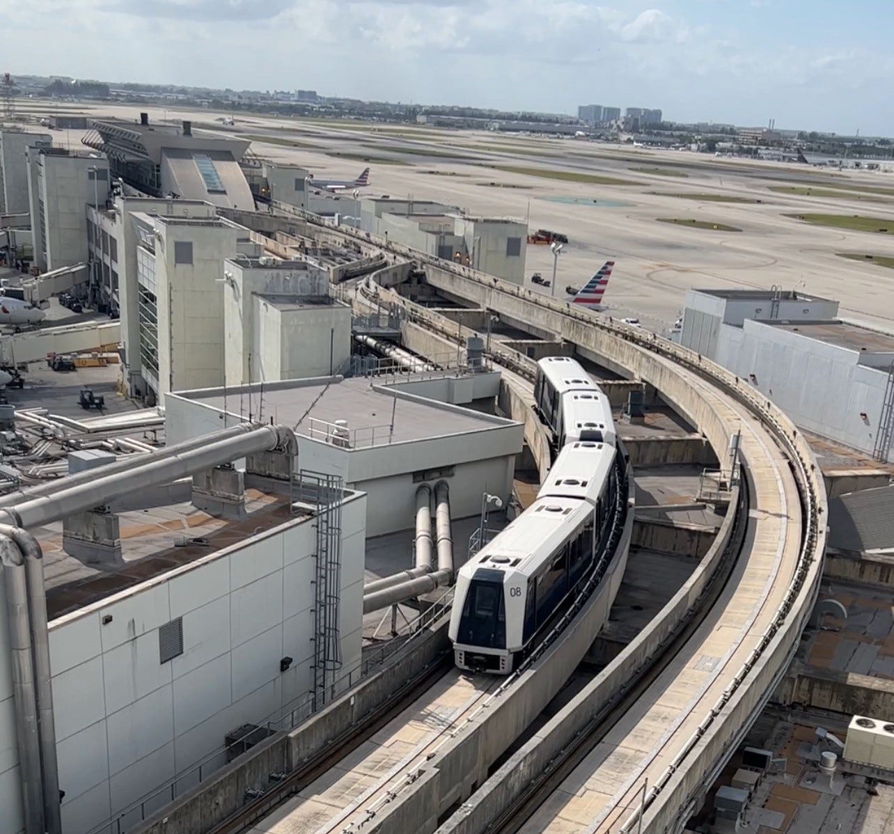
The SkyTrain on the roof of the North Terminal is one example that, in my mind, could have been implemented more pleasantly. Yes, locating a train on the roof of any building requires significant structural support that must pass through the spaces below. The Miami airport took a heavy-handed approach with those supports weighing on the passenger spaces below
Compare the Skytrain to the ExpressTram in the McNamara Terminal at Detroit Metro Airport designed by SmithGroup that opened 2002. While not on the roof of the building, it is elevated above the concourse floor and requires similar structural support that passes through passenger spaces. The implementation, however, does not overwhelm the space. In fact, the tram draws travelers’ attention up from the ground to the clerestory behind it and the sky beyond.
Also, recall who initially conceived of the North Terminal: American. And it did so in the mid-1990s when it was still recovering from a recession that forced some dramatic cutbacks, including the closure of hubs in Nashville, San Jose, Calif., and Raleigh-Durham. It’s priorities at the time were almost certainly low-cost and efficiency — not terms associated with lofty architecture. (For more on airline- versus airport-led projects, read about Delta’s Terminal C at LaGuardia)
When Miami-Dade took over the North Terminal from American it, in all of the reporting I read, focused on controlling costs and finishing the facility — not rethinking the design.
The North Terminal isn’t all bad
The North Terminal is a very function building. Its 51 gates2 handled 62% of Miami’s 26.3 million departing fliers — American’s share — in 2024, U.S. Bureau of Transportation Statistics data via Cirium shows. The rest of the airport, with 75 gates, handled the balance; American does use several of the 15 gates on Concourse E.
The terminal design connects at least 47 gates to a single international arrivals facility that, in itself, is no small feat. I recall landing there years ago and being impressed by how international arrivées are shuttled up onto several cars of the Skytrain segregated from departing travelers, and whisked along to the arrivals facility.
Now, the decision to locate all of that necessary international arrivals infrastructure — the corridors, escalators, lifts, etc — above the concourse floor contributes to the feeling of being in a trench, disconnected from the outside. The drop ceilings in the gate areas also serve a function: as the floor of the arrivals corridor above.
I do not know why the planners placed the international arrivals infrastructure and Skytrain above Concourse D but I am sure part of it was the cost and feasibility of burying it underground.
Some appealing features of the complex are two atria at the eastern and western reaches of Concourse D that offer brief, uplifting respites from the otherwise enclosed space. Though even there, I wonder why the designers opted for a clerestory and artificial light rather than a full skylight — perhaps something to do with the hot, South Florida sun?
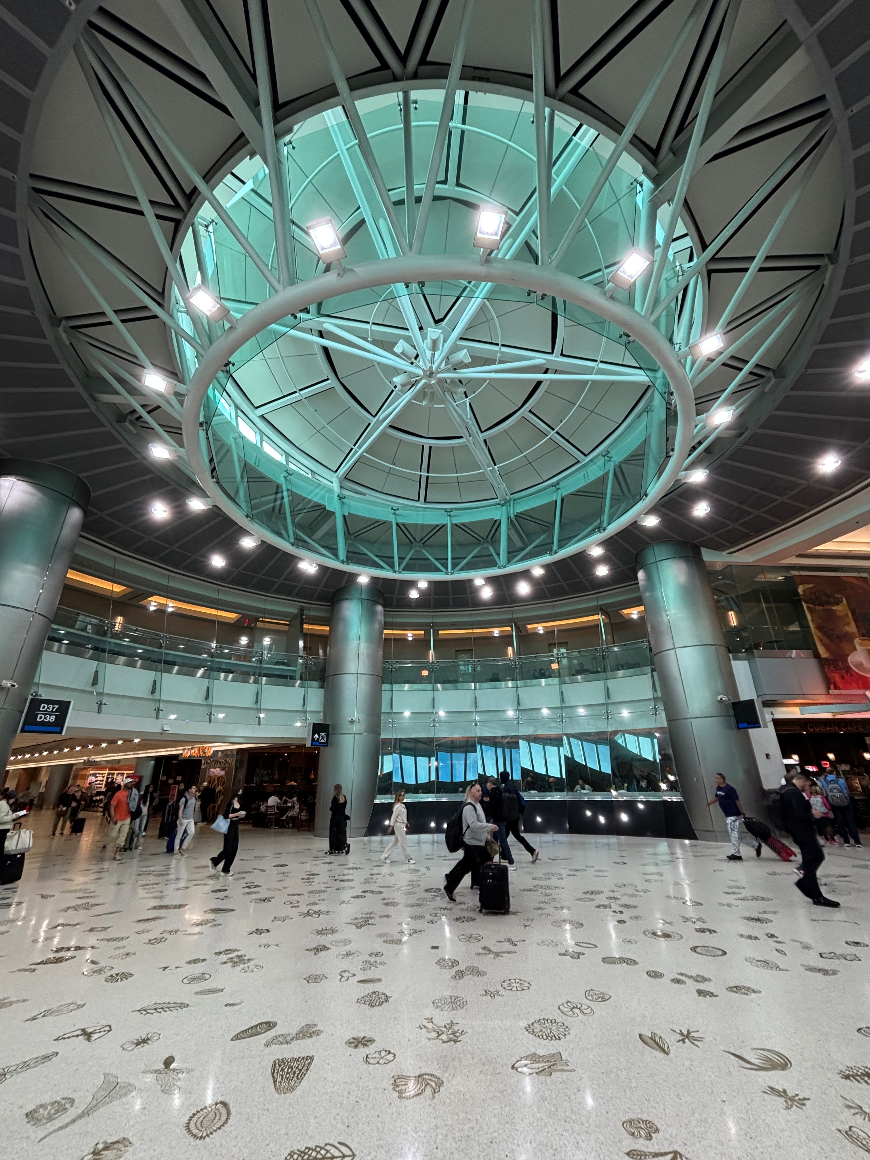
Then there are the skylights that are scattered along the length of the concourse. They let some much-needed natural light into the space.
Fun fact: several of the gate areas with their own skylights were actually part of the original Concourse D structure that opened in the 1980s and was incorporated into the new North Terminal.
And then there is the art. The terrazzo floor embedded with bronze sea shells and aquatic creatures by artist Michele Oka Doner is a wonderful, locally-themed touch.
I was, however, saddened to learn that the audio-visual installation “Harmonic Runway” by Christopher Janney in the connector linking Concourse A3 and the terminal was removed in 2003 as part of the North Terminal work. Janney did receive a second commission at the airport, “Harmonic Convergence,” located in the connector between the terminal and APM station to the Miami Intermodal Center.
“It is public art, the kind that gives architecture new dimensions and allows our spirits to soar,” the Miami Herald wrote on the removal of Harmonic Runway in 2003.
And it’s that, architecture that “allows our spirits to soar,” which Miami’s North Terminal lacks.
I researched the Miami Herald archive through Newsbank’s America’s Newspapers archive accessed via the DC Public Library.
Concourse A opened in 1995 and was incorporated into the North Terminal structure as roughly gates D1-D15.
It’s shocking to hear how recently it was built! Every time I pass through, I think about how I find it to be one of the more dreadful major hubs in the US, and it feels at least 30 years old. For a contrast, I just looked it up and Doha’s airport (the original section) is also 11 years old—yet what a different experience it is!
The architectural blandness seems like such a missed opportunity, given that Miami has lots of tropical/beach vibes, Art Deco architecture, pastel colors, etc. that it could infuse into the building to give it a distinct local feel.
I agree that it’s neat how they did the segregated cars for departures (and domestic arrivals) vs. international arrivals on the people mover.